Step 4: Drafting and Designing
Drafting
Drafting is often where people start their writing process. But this is step 4! The writing will go much smoother if you first complete the other three steps and you will have a much better document.
Once you have completed steps 1-3 then you are finally ready to begin drafting your document. Follow the outline you have made. If your outline matches the structure of the document you are drafting then it will be even easier to write.
In writing paragraphs it is recommended that you follow the old-new method (sometimes called the known-new method).
There are certain rhetorical strategies we use in drafting technical writing documents. These are called Rhetorical Methods of Development, which is a fancy way of saying these are common patterns of organization that you can use to present information.

Designing
You will also want to design your draft. For a document that is primarily text this may simply be selecting headings and formatting paragraphs and fonts. If the document is multimodal, multimedia, or in some other way emphasizes design then you will need to spend more time thinking at this stage about the layout or storyboard of your document. For example if it is a poster, what should the layout look like? Or for a video, you will need to plan or storyboard the scenes as part of design.
CRAP in Design
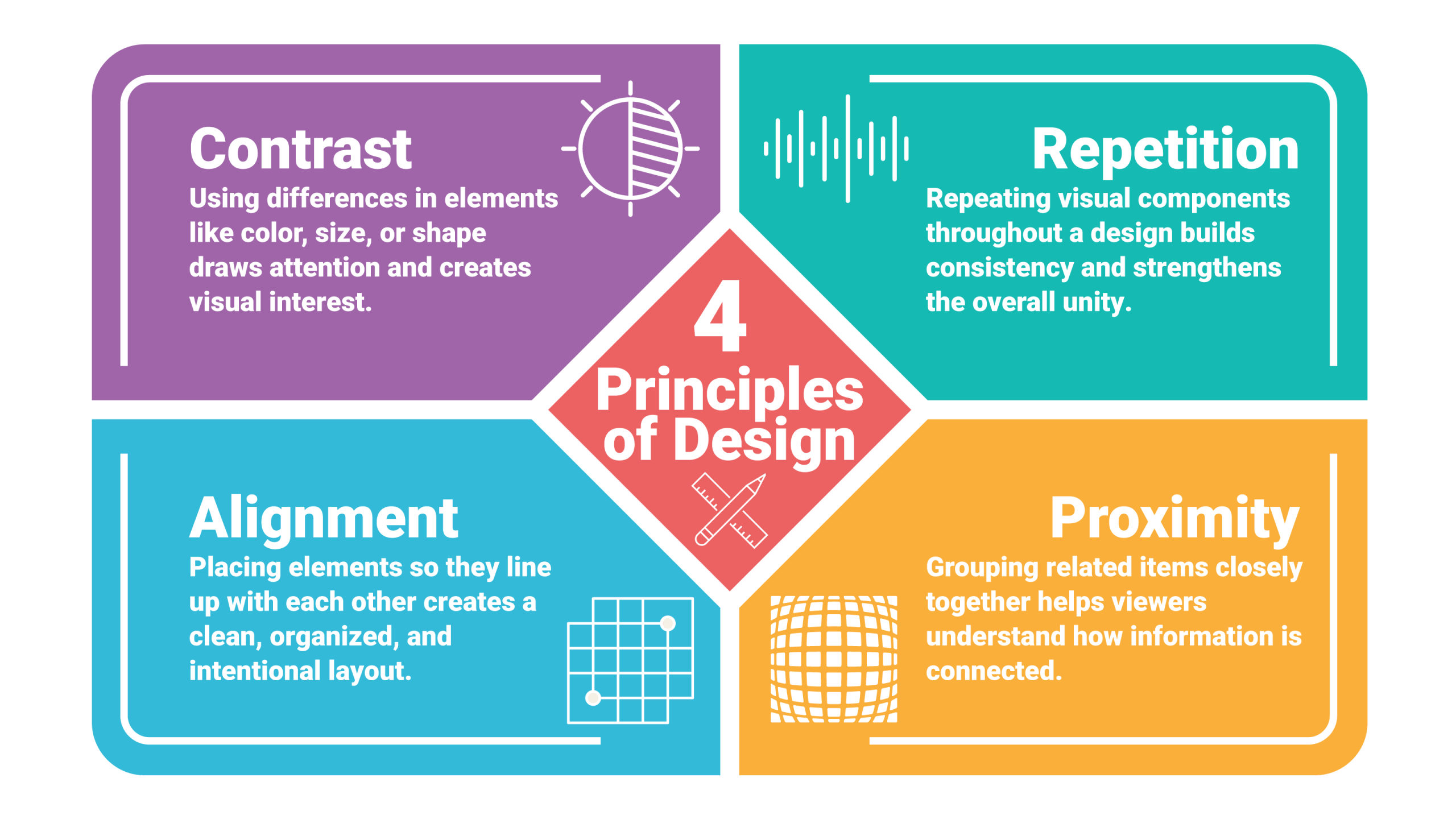
The four basic principles of design are known as C.R.A.P. = contrast, repetition, alignment, and proximity.
- Contrast: Using differences in elements like color, size, or shape draws attention and creates visual interest. Look at look at the title, headings and other places where contrast would help the reader find information and use contrast to draw the readers’ attention.
- Repetition: Repeating visual components through a design builds consistency and strengthens the overall unity. Repetition helps a reader find information and creates a theme for the design.
- Alignment: Placing elements so they line up with each other creates a clean, organized, and intentional layout. Too many elements not aligned creates a confused, cluttered look.
- Proximity: Grouping related items closely together helps viewers understand how information is connected.