
Chapter 11: Visual Aid Types
This chapter is adapted from Stand up, Speak out: The Practice and Ethics of Public Speaking, CC BY-NC-SA 4.0.
What are the advantages and disadvantages of different types of presentation aids?
As we saw in the organic farming conference’s orientation presentation, using presentation aids can be risky. However, with forethought and adequate practice, you’ll learn to choose presentation aids that enhance your message and boost your professional appearance. One principle to keep in mind is to use only as many presentation aids necessary to present your message. Although the maxim “less is more” may sound like a cliché, it really does apply in this instance. The number and the technical sophistication of your presentation aids should never overshadow your speech.
Another important consideration is technology. Keep your presentation aids within the limits of the working technology available to you. Whether or not technology works on your speech day, you will still have to present. What will you do if the computer file containing your slides is corrupted? What will you do if the easel is broken? What if you had counted on stacking your visuals on a table that is gone? Be prepared to adapt to an uncomfortable and scary situation. As the speaker, you are responsible for arranging the things you need to make your presentation aids work as intended. Some tips: bring a roll of duct tape to display your poster even if the easel is gone. Find an extra chair if your table has disappeared. Prepare an alternative plan in case a computer glitch prevents you from using your computer-based presentation aids. The more sophisticated the equipment is, the more you should be prepared with an alternative, even in a smart classroom.
Now that we’ve explored some basic hints for preparing visual aids, let’s look at the most common types of visual aids: charts, graphs, representations, objects, models, and people.
Charts
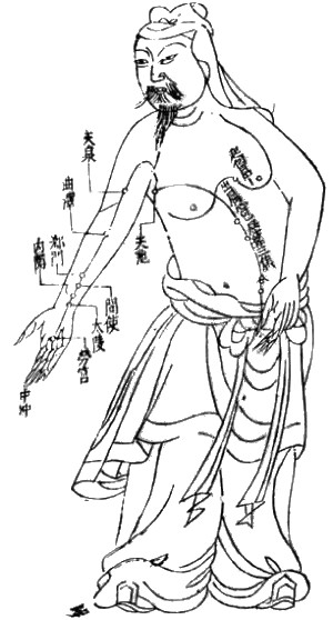
Charts are commonly defined as graphical representations of data, often numerical, or a sketch representing an ordered process. Whether you create your charts or find charts that already exist, it is important for them to match exactly your speech’s specific purpose. For example, the Acupuncture Charts show two charts related to acupuncture. Although both charts are good, they are not equal. One chart is useful in a speech about acupuncture’s history and development, while the other chart is more useful for showing meridian locations, energy flow lines, and acupuncture points.
In the rest of this section, we’re going to explore three common types of charts: statistical charts, sequence-of-steps chart, and decision trees.
Statistical Charts
Figure 10.6
| Public Speaking Anxiety | Distress | |||
|---|---|---|---|---|
| Pre | Post | Pre | Post | |
| Word-repetition (n=21) | 40.24 | 35.48 | 65.38 | 56.23 |
| (8.27) | (10.46) | (19.03) | (20.24) | |
| Positive Self-Affirmation (n=21) | 38.14 | 37.81 | 60.62 | 58.05 |
| (9.33) | (9.75) | (18.23) | (18.23) | |
| Control (n=21) | 37.48 | 37.57 | 56.62 | 54.52 |
| (9.23) | (11.07) | (17.41) | (19.40) | |
Statistical charts provide limited, specific information that requires interpreting and must be kept as simple as possible for most audiences. For example, the Mean and Standard Deviation Table is a statistical chart from a study comparing the effects of cognitive defusion and positive affirmation interventions on reducing public speaking anxiety. Unless you are familiar with statistics, this chart may be very confusing. When visually displaying information from a quantitative study, make sure that you understand the material and can successfully and simply explain how one should interpret the data. If you are unsure about the data yourself, then don’t use this type of information.
Sequence-of-Steps Charts
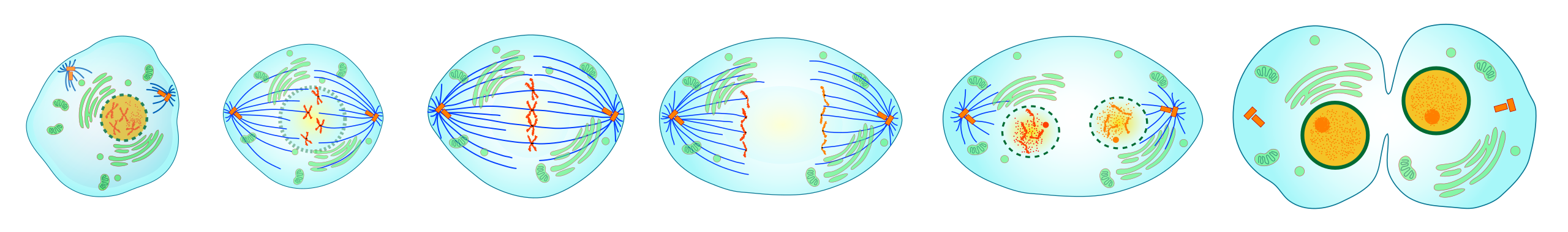

Sequence-of-steps charts are also useful when you explain a process that involves several steps. For example, the two Major Events in Mitosis images both depict the cell division process called mitosis, using a sequence-of-steps chart, but they each deliver different information. The first chart lacks labels to indicate the different cell division phases. Although the first chart may have more color and look more polished, the missing information will confuse an audience. In the second chart, each phase is labeled with a brief explanation of what is happening, which will help an audience understand the process.
Decision Trees
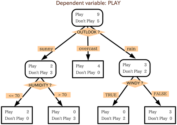
Decision trees are useful for showing the relationships between ideas. The example in the image To Play or Not to Play shows how a decision tree could be used to determine the appropriate baseball-playing weather. As with the other chart types, be sure that the chart’s information is relevant to your speech’s purpose and that each question and decision is clearly labeled.
Graphs
Graphs, strictly speaking, are considered a chart type, but are so widely used that we will discuss them separately. A graph represents quantitative data’s pictorial relationships using dots, lines, bars, pie slices, and the like. Graphs show the variation in one variable compared with that of one or more other variables. Where a statistical chart may report the mean ages of individuals entering college, a graph will show how the mean age changes over time. A statistical chart may report how many computers are sold in the United States, while a graph will show the breakdown of those computers by operating systems such as Windows, Macintosh, and Linux. Public speakers can show graphs using different formats, some of which are specialized for various professional fields. Very complex graphs often contain too much information that is not related to the purpose of a student’s speech. If the graph is cluttered, it becomes difficult to comprehend.
In this section, let’s analyze common graphs that speakers use: line graphs, bar graphs, and pie graphs.
Line Graph
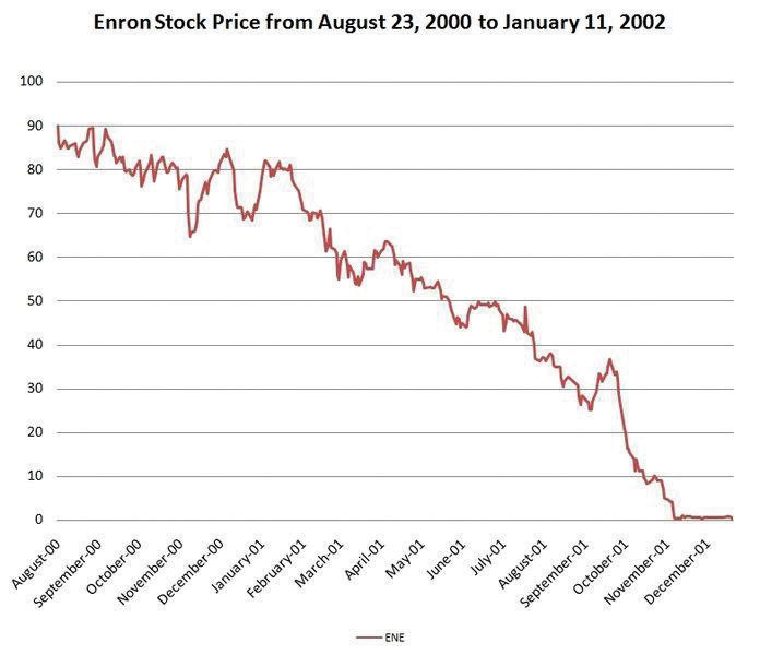
Line graphs are designed to show trends over time. In the Enron’s Stock Price image, we see a line graph depicting Enron’s stock price falling from August 2000 to January 2002. Notice that although it has some steep rises, the line has an overall downward trend clearly depicting Enron’s plummeting stock price. Showing such a line graph helps the audience see the relationships between the numbers, and audiences can understand the information by seeing the graph much more easily than they could if the speaker just read the numbers aloud.
Bar Graph
Bar graphs are used to show differences between quantities. They can be used for population demographics, fuel costs, math ability in different grades, and many other data.
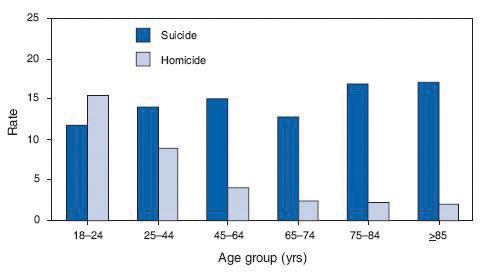
The graph in the image Natural Death vs. Homicide is well designed. It is relatively simple and carefully labeled, making it easy for you to guide your audience through the quantities of each death type. The bar graph is designed to show the difference between natural deaths and homicides across various age groups. When you look at the data, the first grouping clearly shows that eighteen- to twenty-four-year-olds are more likely to die because of a homicide than any other age group.
The image called Distribution of Income and Wealth in the United States is a complicated bar graph depicting the disparity between the-haves- and the-have-nots within the United States. The graph’s left side shows that the top 20 percent of people within the United States account for 84.7 percent of all of the wealth and 50.1 percent of all of the income. On the other hand, those in the bottom 40 percent account for only 0.2 percent of the wealth and 12.1 percent of the actual income.
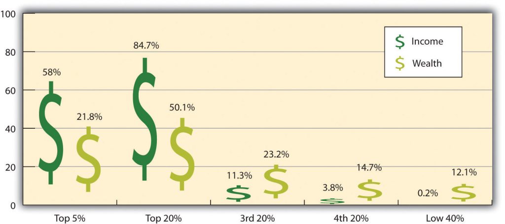
While the graph is very well designed, it presents much information. In a written publication, readers will have time to sit and analyze the graph, but in a speaking situation, audience members must understand the graph information very quickly. For that reason, the Distribution of Income and Wealth in the US graph is probably not as effective for speeches as the Natural Death vs. Homicide graph.
Pie Graph
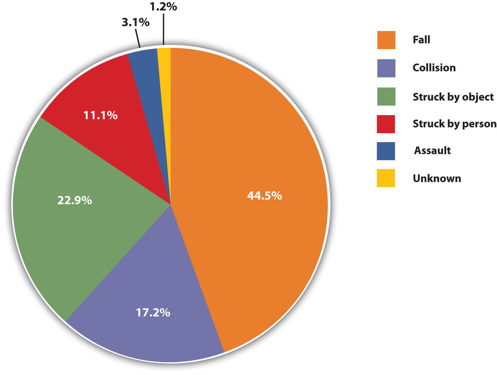
Pie graphs should be simplified as much as possible without eliminating important information. As with other graphs, the sections of the pie need to be plotted proportionally. In the pie graph shown in Figure 10.12 “Causes of Concussions in Children”, we see a clear and proportional chart that has been color-coded. Color-coding is useful when it’s difficult to fit the explanations in the actual sections of the graph; in that case, you need to include a legend, or key, to indicate what the colors in the graph mean. In this graph, audience members can see very quickly that falls are the primary reason children receive concussions.
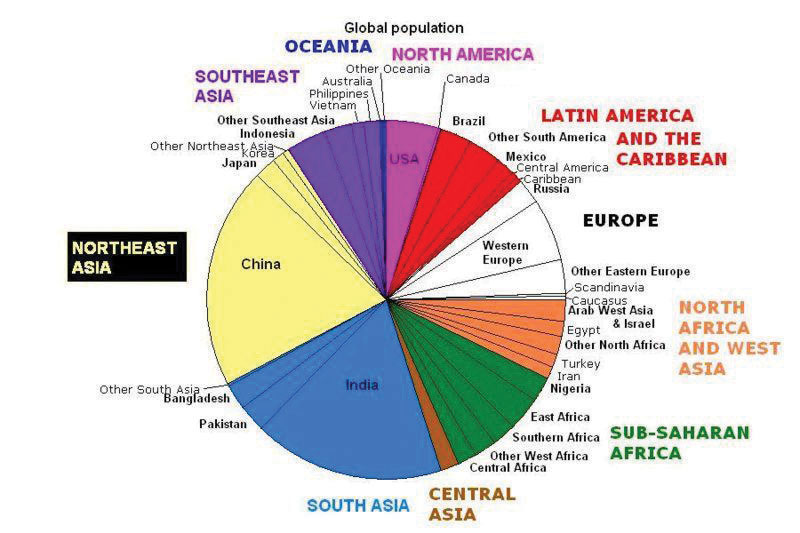
The pie graph World Populations is jumbled, illegible, confusing, and overwhelming in every way. The color-coding doesn’t help. Overall, this graph simply contains too much information and is more likely to confuse an audience than help them understand something.
Representations
Representations are presentation aids designed to represent real processes or objects. Often, speakers want to visually demonstrate something that they cannot physically bring with them to their speech. For example, if you’re giving a speech on the human brain, and you just don’t have access to a cadaver’s brain, use a picture of a brain or an image that represents the human brain instead.
In this section let’s explore four common representations: diagrams, maps, photographs, and video or recordings.
Diagrams
Diagrams are drawings or sketches that outline and explain an object’s parts, a process, or phenomenon that cannot be readily seen. Like graphs, diagrams are considered a chart type, as in organization charts and process flow charts.
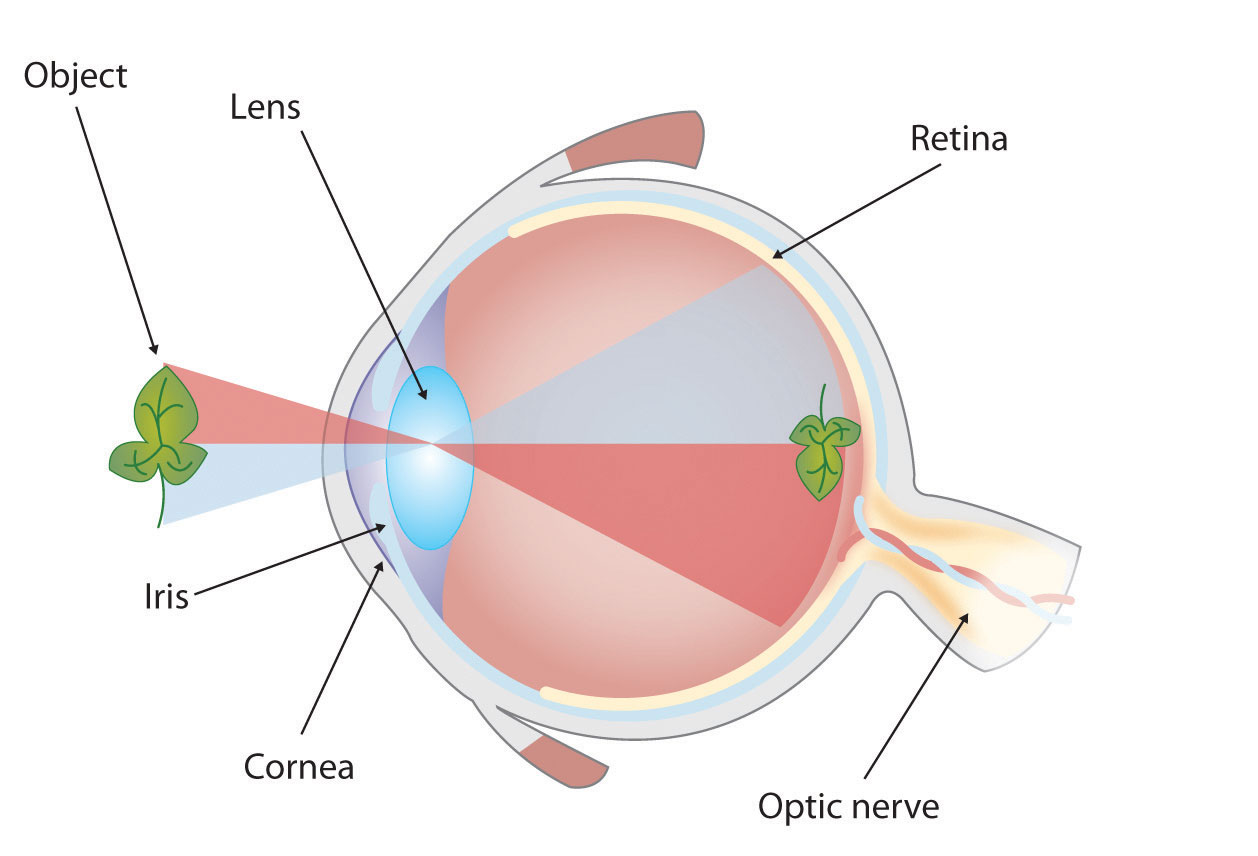
When you use a diagram, explain each part of the object, process, or phenomenon, and pay special attention to elements that are complicated or prone to misunderstanding. In The Human Eye diagram, you might wish to highlight that the light stimulus is reversed when it is processed through the brain or that the optic nerve is not a single stalk as many people think.
Maps
Maps are extremely useful to emphasize clear and limited information. There are numerous map types, including population, weather, ocean current, political, and economic maps, so find the right kind for your speech’s purpose. Choose a map that emphasizes the information you need to deliver.
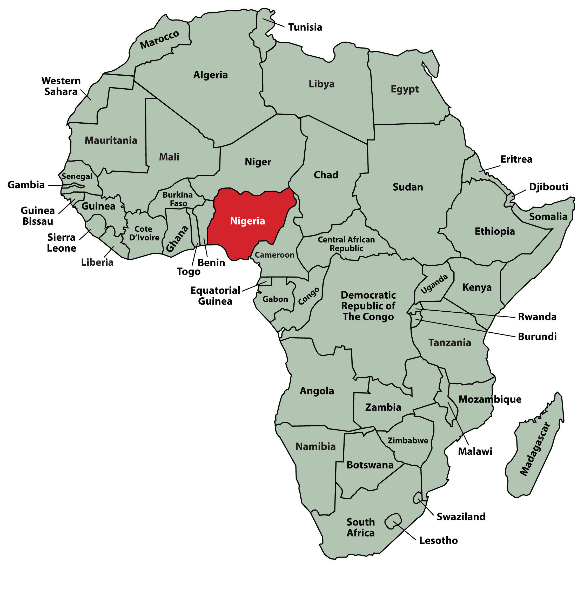
The map called African Map with Nigerian Emphasis is simple, showing clearly Nigeria’s geographic location. This can be extremely valuable for audience members who cannot name or locate countries on the African continent.
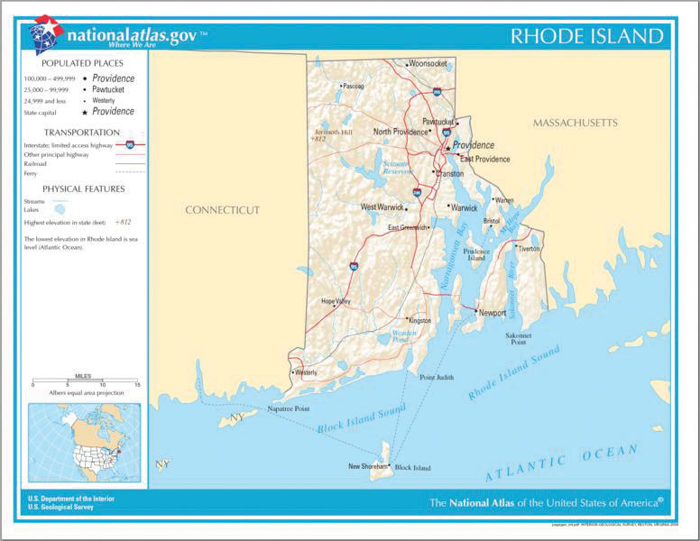
The Rhode Island Map emphasizes the complicated configuration of islands and waterways that characterize this state’s geography. Although the map does not list the islands’ names, it is helpful in orienting the audience to the islands’ directions and distances to other geographic features, such as the city of Providence and the Atlantic Ocean.
Photographs and Drawings

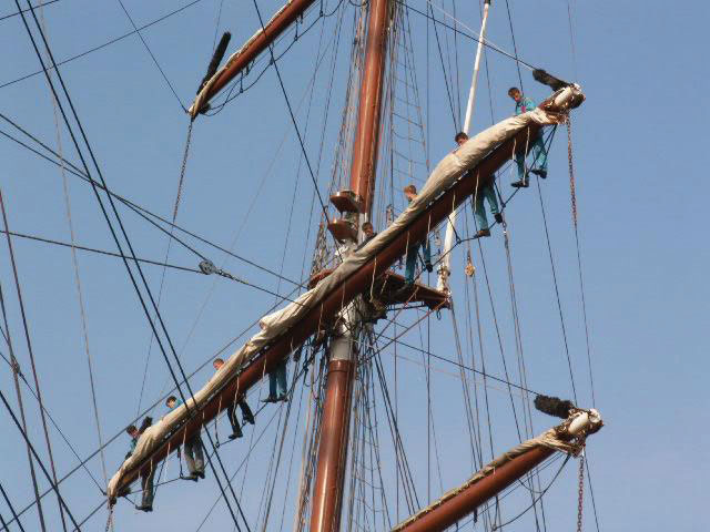
Photographs or drawings are sometimes the best way to show unfamiliar but important details. For example, the Wigwam picture shows a North East Native American living dwelling in which you can see the curved birchbark exterior that makes this dwelling so ideal for various weather conditions. Likewise, the tall ship in the Ship’s Rigging image emphasizes the sheer amount and complexity of a ship’s rigging.
Video and Audio Recordings
Video and audio recordings are very useful to enhance speeches by demonstrating, explaining, or showing important aspects of your presentation, whether it is a well-chosen short YouTube or Vimeo video, a segment from a song, or a piece of a podcast.
For example, imagine that you’re giving a speech on how Lap-Band® surgeries help people lose weight. In one of your speech sections, show the following forty-three-second video to demonstrate the surgical part of how it works: Lap Band Procedure Animation. Also, you could offer a real patient recording explaining why he or she decided to get Lap-Band surgery.
There is one major caveat to using audio and video clips during a speech: do not forget that they are only aids to your speech, not the speech itself! In addition, be sure to avoid these three mistakes that speakers often make when using audio and video clips: 1) Avoid choosing clips that are too long for the overall speech length. If you are giving a five-minute speech, then any audio or video clip you use should be under thirty seconds. 2) Practice with the audio or video equipment prior to speaking. If you are unfamiliar with the equipment, you’ll look foolish figuring out how it works, distract the audience from your speech, and negatively impact your credibility. 3) Don’t fail to cue the clip to the appropriate place prior to beginning your speech. We cannot tell you how often we’ve seen students spend valuable speech-time trying to find a YouTube or DVD clip. Make sure your clip is ready to go before you start speaking.
Objects or Models
Objects and models are other presentation aids that help your audience understand your message. Objects refer to anything you can hold up and talk about during your speech. For example, if you’re talking about the importance of not using plastic water bottles, hold up a plastic water bottle and a stainless-steel water bottle as examples. If you’re talking about musical percussion instruments and you own and can play several different types, bring some to show your audience what they look like and how they sound.
Models, on the other hand, are re-creations of physical objects that you otherwise cannot provide during a speech. For example, if you’re speech is on heart murmurs, show how heart murmurs work by holding up a human heart model.
Animals
Animal topic speeches are fun, and bringing an animal adds a very engaging dimension as your presentation aid. However, while this is tempting, it carries some serious risks to consider.
The first risk is that animal behavior is unpredictable. You may think this won’t be a problem if your presentation animal is small enough to be kept confined throughout your speech—for example, a goldfish in a bowl, or lizard in a jug, or bird in a cage. However, even caged animals can distract your audience if they run about, chirp, or exhibit other agitated behavior. Also, chances are great that an animal will react stressfully to the unfamiliar situation by displaying behavior that does not contribute positively to your speech. The second risk is that some audience members may respond negatively to a live animal. For example, many people have fears and aversions to animals like snakes, spiders, and mice; and some have animal allergies. The third risk is that some locations may have regulations about bringing animals onto the premises. If animals are allowed, the person bringing the animal may be required to bring a veterinary certificate or may be legally responsible for any damage caused by the animal.
For these reasons, before you decide to use an animal as a presentation aid, ask yourself if you could make your point equally well with a picture, model, diagram, or other animal representation.
The Speaker as a Presentation Aid – Appropriate Attire
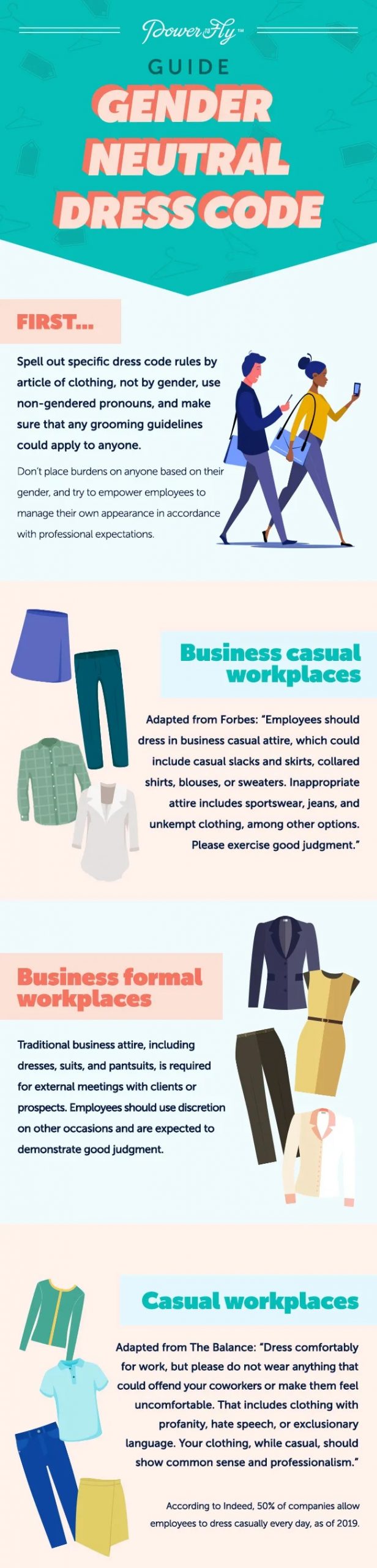
Accessible Version: Guide Gender Neutral Dress Code
The speaker—you—are your best presentation aid, and even if you don’t mean to be, you are always the audience’s visual aid. Some of this section has been covered in previous chapters, but the information is worth revisiting. Sometimes speakers are purposefully visual. For example, if your speech is about ballroom dancing or ballet, you use your body to demonstrate the basic moves in the cha-cha or the five basic ballet positions.
Otherwise, you, the speaker, are the visual aid without realizing it. So, be prepared! This means that you must dress appropriately for your speech. As difficult as it is for some people to be the center of attention, your speaker-rating will be higher if your other visual aids do not distract from you, and how you dress plays into your speaker ethos. Think about wearing clothing, shoes, and accessories that are purposefully chosen for your speech and that do not distract the audience. Often, it is suggested to wear office professional attire.
Office professional attire guidelines are on a continuum depending on where and who your audience is. It is not either/or. Let’s look at the fabric continuum for example: Soft, semi-soft, semi-stiff, and stiff fabric. Soft fabrics are less professional—a sweater or t-shirt is soft fabric. As the fabric gets stiffer, it moves along the continuum toward more professional. Suits, for example, are very stiff material, thus more professional. It is not necessary for a speaker to wear a suit for every speaking occasion, but as the speaker—the visual aid—make sure you dress appropriately for the occasion, the audience, and the speech topic.
For example, if you work for a blood drive service, and you are going to speak at a local church to encourage the audience to give blood. What would you wear? Think about your audience, the topic, and the occasion. It is probably a good idea to wear a shirt affiliated with the blood-collecting company, and depending on the church and how formal or informal the audience is, wear nice pants with a tie, or not. If the church is informal, wear your company shirt, a nice pair of jeans, and a nice pair of shoes. The general rule for dressing appropriately for any speaking situation is that your attire is a little nicer than the audience’s. This gives you—the speaker, a sense of authority and ethos when you are dressed appropriately, and it shows that you really thought about how your outfit, shoes, and accessories match your speech.
Other People as Presentation Aids
Other people as presentation aids are effective for demonstrations especially when it can be cumbersome and distracting for the speaker to use her or his own body to illustrate a point. In such cases, ask someone else to serve as your presentation aid.
Ask a person or persons ahead of time to be your presentation aid—do not assume that an audience member will volunteer on the spot. For example, if you plan to demonstrate how to immobilize a broken bone, an effective volunteer must know ahead of time that you will touch him or her as much as necessary to splint their foot. Also, make certain that they will arrive dressed presentably and that their appearance or behavior will not draw attention away from your message.
The transaction between you and your human presentation aid must be appropriate, especially if you are going to demonstrate something like a dance step. Use your absolute best judgment about behavior, and make sure that your human presentation aid understands the task’s dimension.
How do I use presentation software?
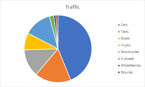
Pie Charts like the one pictured in the Presentation Software Image are great to include in your visual aid, and presentation software helps to easily show images like this to the audience. The most popular presentation software programs are PowerPoint and Prezi.
Watch comedian Don McMillan share his PowerPoint perspective, though what he says applies to all presentation software. Look at the questions below, and notice various elements to avoid and elements to pay attention to when making a presentation software visual aid.
- What are some of the problems with presentation software and PowerPoints (PPTs) that McMillan points out sarcastically?
- Have you created any PPTs that look like the examples he offers?
- What did you learn from this video?
- What did you like about this video in relation to PPTs?
- What do you notice about the comedian’s use of color?
- If there are things you think you will change now about your visual aid, PPT, Prezi, etc., what are these things?
Life after death by PowerPoint (Corporate Comedy Video), by Don McMillan, Standard YouTube License. https://www.youtube.com/watch?v=KbSPPFYxx3o
Presentation Software Guidelines
- Do not overwhelm listeners with complicated slides.
- Do not read the slides to your audience.
- You should narrate by giving your audience the context for your slides.
- Make sure the images, graphics, words, etc., are large enough to read.
- Do not block the audience’s view of the slides.
- Do not show a slide when you are not talking about it. Consider placing a blank slide between content slides to help keep your audience’s attention.
- Do not present in the dark. Make sure the audience can see you, even in dim light. You are the focus, not your aid.
- Anticipate problems, especially when using technology. Plan ahead.
Examples
Take a look these example PowerPoints. Read the text below them to know what to look for in the presentation. They have no audio; they are just examples of how to or how not to use text and images in presentation software.
Example 1
https://www.youtube.com/watch?v=FlAlgFltjiY
Notice how there is a good use of just images and titles on these slides and not a lot of words. Notice that there are titles; each slide should have at least a one-word title. You do not want tons of words on your PPT, as this will encourage the audience and you, the speaker, to read from the PPT. That is not the reason for doing a PPT or using presentation software.
Example 2
https://www.youtube.com/watch?v=l_4W_sBc0jQ
Notice how these PPT slides are creative, but they are also far too distracting for the audience. If you use these kind of slides, the audience will be focused on the slides (visual aid) and not on what you are saying. You want the audience to pay attention and listen to you, and the slides are only an aid, a visual aid, not the whole presentation.
Example 3
https://youtu.be/EMmBX69kv0Q
Notice how these slides do not have many words, but they are just a little too simple. There is no graphic on the slide, there are only words, which is not the main job of a visual aid. The visual aid should be more than just words alone. You can speak the words, but you can’t speak the images or graphics.
Example 4
https://www.youtube.com/watch?v=jYPOUfruDmM
Notice how these slides are just right! They are simple, but not too simple; not too many words; not distracting for the audience; have graphics that are interesting, but not too many graphics; can be easily seen by the audience; and have a good calming color scheme.
References
Brandrick, C., Hooper, N., Roche, B., Kanter, J., & Tyndall, I. (2021). A comparison of ultra-brief cognitive defusion and positive affirmation interventions on the reduction of public speaking anxiety. Psychological Record, 71(1), 113. https://doi-org.libprox1.slcc.edu/10.1007/s40732-020-00432-z
University of Minnesota. (2011). Stand up, Speak out: The Practice and Ethics of Public Speaking. University of Minnesota Libraries Publishing. https://open.lib.umn.edu/publicspeaking/. CC BY-SA 4.0.
Media References
Brutannica. (2008, March). World population pie chart [Image]. Wikimedia Commons. https://commons.wikimedia.org/wiki/File:World_population_pie_chart.JPG
Centers for Disease Control and Prevention. (2007, June 29). Homicide suicide USA [Gif]. Wikimedia Commons. https://commons.wikimedia.org/wiki/File:Homicide_suicide_USA.gif
iheartpandas. (2007, October 8). Wigwams [Image]. Flickr. https://www.flickr.com/photos/iheartpandas/1576706333/
King, C. (2021, October 19). Traffic pie chart [Image]. Center for eLearning, Salt Lake Community College.
LadyofHats. (2008, 10 September). Mitosis cells sequence [Image]. Wikimedia Commons. https://commons.wikimedia.org/wiki/File:Mitosis_cells_sequence.svg
McMillan, Don. (2009, November 9). Life after death by PowerPoint [Video]. YouTube. https://www.youtube.com/watch?v=KbSPPFYxx3o
NCBI. (2006, 29 August). MajorEventsInMitosis [Image]. Wikimedia Commons. https://commons.wikimedia.org/wiki/File:MajorEventsInMitosis.jpg
Nehrams2020. (2009, August 10). Enron Stock Price Aug 00 Jan 02 [Image]. Wikimedia Commons. https://commons.wikimedia.org/wiki/File:EnronStockPriceAug00Jan02.jpg
Nojhan. (2005, August 21). Tall ship rigging in Amsterdam close [Image]. Wikimedia Commons. https://commons.wikimedia.org/wiki/File:Tall_ship_rigging_in_amsterdam_close.jpg
Plumhoff, K. (2019). Guide Gender Neutral Dress Code. Power to Fly. https://blog.powertofly.com/gender-neutral-dress-code
T-kita. (2005, October 8). Decision tree model [Image]. Wikimedia Commons. https://commons.wikimedia.org/wiki/File:Decision_tree_model.png
Unknown. (Ming Dynasty). Acupuncture chart [Image]. Wikimedia Commons. https://commons.wikimedia.org/wiki/File:Acupuncture_chart_300px.jpg
Unknown. (2011). African Map with Nigerian Emphasis [Image]. University of Minnesota Libraries Publishing, University of Minnesota. https://open.lib.umn.edu/publicspeaking/chapter/15-2-types-of-presentation-aids/
Unknown. (2011). Causes of Concussions in Children [Image]. University of Minnesota Libraries Publishing, University of Minnesota. https://open.lib.umn.edu/publicspeaking/chapter/15-2-types-of-presentation-aids/
Unknown. (2011). Chinese lettering amplified diagram [Image]. University of Minnesota Libraries Publishing, University of Minnesota. https://open.lib.umn.edu/publicspeaking/chapter/15-1-functions-of-presentation-aids/
Unknown. (2011). Coriolis effect diagram [Image]. University of Minnesota Libraries Publishing, University of Minnesota. https://open.lib.umn.edu/publicspeaking/chapter/15-1-functions-of-presentation-aids/
Unknown. (2011). Rhode Island Map [Image]. University of Minnesota Libraries Publishing, University of Minnesota. https://open.lib.umn.edu/publicspeaking/chapter/15-2-types-of-presentation-aids/
Unknown. (2011). The Human Eye [Image]. University of Minnesota Libraries Publishing , University of Minnesota. https://open.lib.umn.edu/publicspeaking/chapter/15-2-types-of-presentation-aids/
Unknown. (2011). Petroglyph diagram [Image]. University of Minnesota Libraries Publishing, University of Minnesota. https://open.lib.umn.edu/publicspeaking/chapter/15-1-functions-of-presentation-aids/
Unknown. (2011). Planetary water supply diagram [Image]. University of Minnesota Libraries Publishing, University of Minnesota. https://open.lib.umn.edu/publicspeaking/chapter/15-1-functions-of-presentation-aids/
