
Chapter 10: Visual Aid
This chapter is adapted from Stand up, Speak out: The Practice and Ethics of Public Speaking, CC BY-NC-SA 4.0.
What is the importance of visual aids?
Reasons Visual Aids Are Important in Public Speaking
Visual aids, which we will also refer to as presentation aids in this chapter, fulfill several functions: they can help your audience understand the information you are conveying, help you clarify a complex message or visual information, help to emphasize important ideas, help the audience remember and retain the message, add variety and interest to your speech, and enhance your credibility as a speaker. Let’s examine each of these functions.
To Improve Audience Understanding
Presentation aids help the audience understand your information. Human communication is a complex process that often leads to misunderstandings. If you are like most people, you can easily remember incidents when you misunderstood a message or when someone else misunderstood what you said to them. Misunderstandings happen in public speaking just as they do in everyday conversations.
One reason for misunderstandings is the fact that perception and interpretation are highly complex individual processes. Most of us have seen the image in which, depending on your perception, you see either the outline of a vase or the facial profiles of two people facing each other. This shows how interpretations can differ.
As a speaker, one of your basic goals is to help your audience understand your message. If some of the information you convey is unclear, your listeners will feel puzzled or possibly even misled. One way to reduce misunderstandings is to use thoughtfully prepared presentation aids.
To Clarify
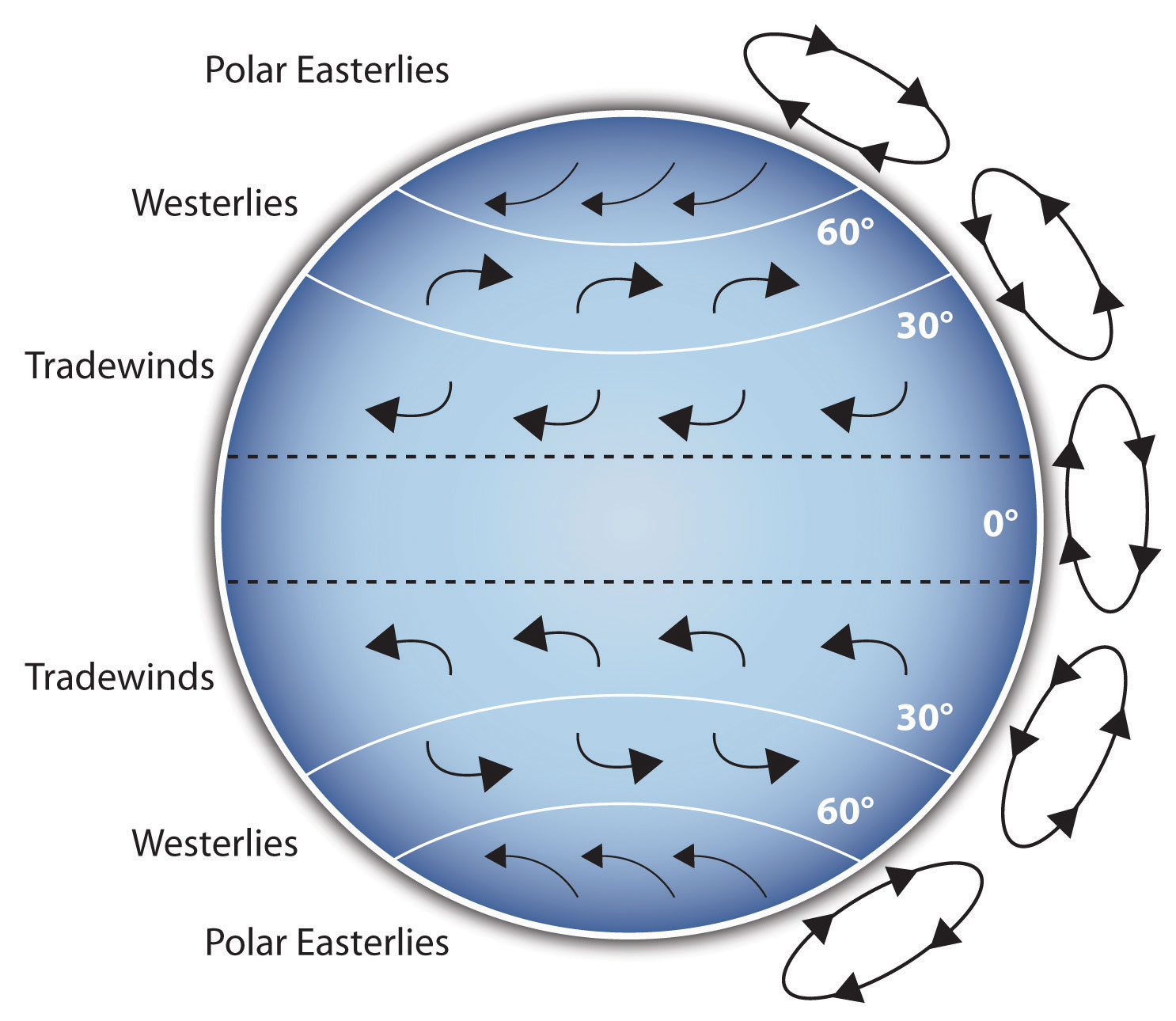
Presentation aids can help clarify a complex message or visual information. For instance, if your speech is about the Coriolis effect’s impact on tropical storms, you will have great difficulty clarifying it without a diagram because the process is complex. The Coriolis Effect diagram you see is effective because it shows the audience the interaction between equatorial wind patterns and other directional wind patterns. The diagram allows the audience to process the information in two ways: through your verbal explanation and through the diagram’ visual elements.

Another way visual aids clarify is when a speaker wants to help audience members understand a visual concept. For example, if a speaker is talking about the importance of petroglyphs in Native American culture, just describing the petroglyphs won’t completely convey what they look like. Instead, show a petroglyph example such as in the Petroglyph image. Notice how more easily your audience can form a clear mental image of your intended meaning.
To Emphasize
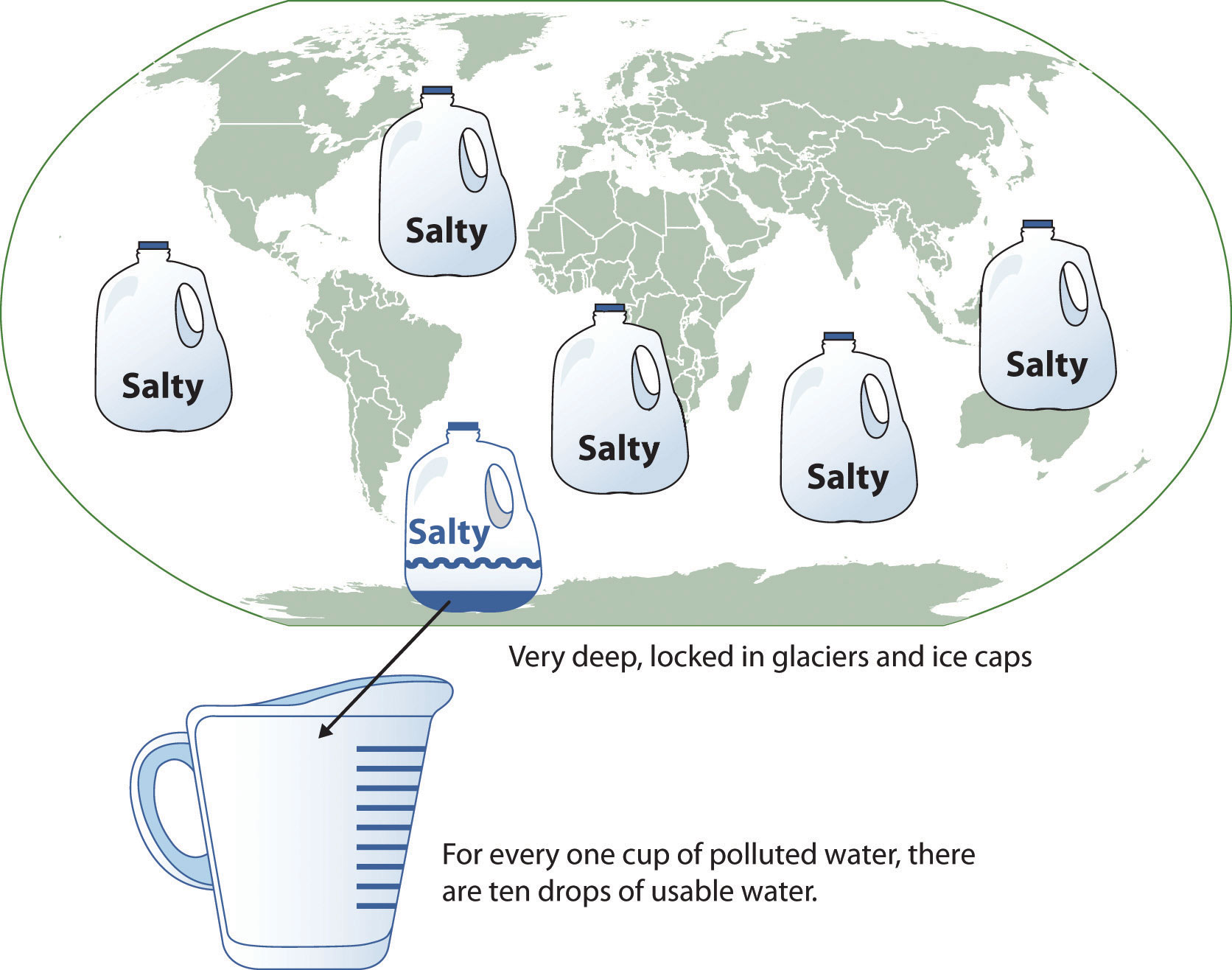
Presentation aids also help emphasize important ideas. For example, in a water conservation speech, you want to show water’s environmental proportions. When you use a conceptual drawing like the one in the Planetary Water Supply image, you show that if the world’s water supply were equal to ten gallons, only ten drops would be available and potable for human or household consumption. This drawing is effective because it emphasizes useful water’s scarcity and thus draws attention to this important information in your speech.

Another way to emphasize a specific interesting aspect of your speech is to visually zoom in. In the Chinese Lettering Amplified image, we see a visual aid of various parts of Chinese characters. On the left side of the visual aid, see how the characters all fit together, with an emphasized version of a single character on the right.
To Aid Retention and Recall
Presentation aids also function to help the audience remembering and retain your speech. A 1996 US Department of Labor article summarizes research on how people learn and remember. The authors found that “83 percent of human learning occurs visually, and the remaining 17 percent through the other senses: 11 percent through hearing, 3.5 percent through smell, 1 percent through taste, and 1.5 percent through touch” (United States Department of Labor, 1996). Since most people learn visually, this learning component is very important. The article goes on to note that information stored in long-term memory is also affected by how we originally learn the material. For example, in a memory study, learners were asked to recall information after three days. The researchers found that the learners retained 10 percent of what they heard from an oral presentation, 35 percent from a visual presentation, and 65 percent from a visual and oral presentation (Lockard & Sidowski, 1961). It’s amazing to see how the combined effect of both visual and oral components can contribute to long-term memory.
For this reason, showing a visual image aids your listeners’ memory. When you deliver effective graphic images and when your audience understand them clearly, they are likely to remember your message long after your speech is over. Moreover, people often remember information that is presented in sequential steps more easily than if that information is presented in an unorganized pattern. When you use a presentation aid to display your speech’s organizational sequence, you help your listeners to observe, follow, and remember your information.
An added plus to using presentation aids is that they can boost your memory while you are speaking. Using your presentation aids while you rehearse your speech will familiarize you with the association between a given place in your speech and the presentation aid that accompanies that material. For example, if you are giving an informative speech about diamonds, display a slide sequence illustrating the most popular diamond shapes: brilliant, marquise, emerald, and so on. As you finish describing one shape and advance to the next slide, seeing the next diamond shape will help you remember the information that you are going to deliver.
To Add Variety and Interest
Additionally, well-chosen presentation aids add variety and interest to your speech. For example, you may have prepared a very good speech to inform local gardeners about several new rose varieties suitable for growing in their area. Although your listeners will undoubtedly understand and remember your message well without any presentation aids, your speech will have a greater impact if you accompany your remarks with a picture of each rose. But, imagine how your audience will be even more enthralled if you display an actual flower of each variety in a bud vase!
To Enhance a Speaker’s Credibility
Presentation aids can also enhance your credibility as a speaker and will contribute to your professional image. However, your presentation aids must contain important information, be clear, clean, uncluttered, organized, and large enough for the audience to see and interpret correctly. Also, you must give proper credit to your presentation aid’s source. Using a statistical chart or a map without proper credit will detract from your credibility, just as would not citing a quotation credit in your speech.
But, keep in mind that presentation aids alone will not be enough to create a professional image, nor will impressive presentation aids rescue a poor speech. And, even if you give a good speech, you will appear unprofessional if your presentation aids are poorly executed. Misspellings and shoddy designs can damage your credibility as a speaker.
If you focus your efforts on producing presentation aids that contribute effectively to your meaning, that look professional, and that are handled well, your audience will most likely appreciate your efforts and pay close attention to your message. That attention will help them learn or understand your topic in a new way and will thus help the audience see you as a knowledgeable, competent, credible speaker.
What types of media can I use as presentation aids?
Your speech venue will dictate how you use presentation aids. For example, in your classroom, you have several choices, including some that omit technology. If you are speaking in a large auditorium, you will almost certainly need to use technology to project large-screen text and images.
Many students feel that they lack the artistic skills to render their own graphics, so they opt to use copyright-free graphics on their presentation aids. You may do this as long as you use images that are created in a consistent style. For instance, do not combine realistic renderings with cartoons unless there is a clear and compelling reason to do so. Being selective will produce presentation aids that look like a coherent set, thereby enhancing your professionalism.
Create your presentation aids with careful choices and effective designs. They should never look or be hastily made, dirty, battered, or disorganized. They do not have to be fancy, but they do need to look professional.
In this section, let’s discuss the major presentation media types to use, such as computer-based media, audiovisual media, and low-tech media.
Computer-Based Media
In most business, industry, and other professional careers for which students are preparing themselves, computer-based presentation aids are the norm today. Whether the context is a weekly department meeting in a small conference room or an annual convention in a huge amphitheater, speakers are expected to be comfortable using PowerPoint or other similar software to create and display presentation aids.
If your public speaking course meets in a smart classroom, you’ve probably had the opportunity to see the computer system in action. Many such systems today are nimble and easy to use. Still, easy is a relative term. Don’t take for granted someone else’s advice that “it’s really self-explanatory”—instead, make sure to practice ahead of time. It is also wise to be prepared for technical problems, which can happen to even the most sophisticated computer users. When Steve Jobs, CEO of Apple and cofounder of Pixar, introduced a new iPhone 4 in June, 2010, his own visual presentation froze (Macworld, 2010). The irony of a high-tech guru’s technology not working at a public presentation did not escape news organizations’ notice.
Presentation Software
Computer presentations were first introduced to the world back in the 1970s, but these software packages were expensive and needed highly trained technicians to operate the programs. Today, there are many presentation software programs that are free or relatively inexpensive and that non-specialists can learn quickly. See the Presentation Software Packages list for examples.
Table 10.1 Presentation Software Packages
| Name | Price |
|---|---|
| Google Presentations | Free |
| Keynote | $ |
| OpenOffice Impress | Free |
| PowerPoint | $ |
| PrezentIt | Free |
| Prezi | Free/$ |
| ThinkFree Show | Free |
| Zoho Show | Free |
In addition to becoming more readily accessible, presentation software has become more flexible over the years. As recently as the mid-2000s, critics such as the eminent graphic expert and NASA consultant Edward Tufte charged that PowerPoint’s tendency to force the user to put a certain number of bullet points on each slide in a certain format seriously threatened the presentation data’s accuracy. As Tufte put it, “The rigid slide-by-slide hierarchies, indifferent to content, slice and dice the evidence into arbitrary compartments, producing an anti-narrative with choppy continuity” (Tufte, 2005). Tufte argues that poor decision making, such as was involved with the 2003 space shuttle Columbia disaster, may have been related to such presentation aid’s shortcomings in NASA meetings. While recent versions of PowerPoint and similar programs allow much more creative slide-design freedom, this freedom comes with a responsibility—the user must take responsibility for using the technology to support the speech and not get carried away with the software’s many special effects.
Good Design Principles
In essence, observe the universal principles of good design, which include unity, emphasis or focal point, scale and proportion, balance, and rhythm (Lauer & Pentak, 2000). As we’ve mentioned earlier, it’s generally best to use one text font on your visuals so that they look like a unified set. In terms of scale or proportion, make sure the information is large enough for the audience to see; and since the display size may vary according to the monitor you are using, it is imperative to practice in advance with the equipment you intend to use. Your slide display’s rhythm should be reasonably consistent—don’t display a dozen different slides in the first minute of a five-minute presentation and then display only one slide per minute for the speech’s duration.
Interactive Clickers
In addition to presentation software such as PowerPoint, interactive computer-based presentation aids are also available. These are often called “clickers”—handheld units that audience members hold and that are connected to a monitor to which the speaker has access. These interactive aids are useful for tracking audience responses to questions, and they have the advantage over asking for a show of hands in that they can be anonymous. Many various course instructors use clickers in their classrooms.
Using computer-based speech aids brings up a few logistical considerations. In some venues, you may need to stand behind a high-tech console to operate the computer. Be aware that this will physically isolate you from the audience with whom you are trying to establish a relationship. When you stand behind presentation equipment, you may feel really comfortable, but you end up limiting your nonverbal interaction with your audience. On speech day, arrive early enough to test out the equipment before class begins.
Audiovisual Media
Although audio and video clips are often computer-based, they can be, and in past decades, were always used without a computer.
Audio presentation aids are useful for illustrating musical themes. For instance, if you’re speaking about how nature sounds inspired Polish composer Frederick Chopin, convey that meaning through playing an example. If you have a smart classroom, use it to play an MP3. Alternatively, you may need to bring your music player. In that case, be sure the room’s speakers work. The people in the back of the room must be able to hear it, and the speakers must not sound distorted when you turn up the volume.
Video presentation aids that clarify, explain, amplify, emphasize, or illustrate a speech’s key concept is appropriate, as long as you do not rely on the video to do your presentation for you. There are several things you must do. First, identify a specific video section that delivers meaning. Second, cue the video so that you can just pop it into the player, and it will begin at the right place. Third, tell your audience where the footage comes from, for instance, you are showing them an example from the 1985 BBC documentary In Search of the Trojan War. Fourth, tell your audience why you’re showing the footage, such as, “This is an example of storytelling in the Bardic tradition.” You can interrupt or mute the video to make a comment about it, but your total footage should not use more than 20 percent of your speech time.
Low-Tech Media
Low-tech media such as chalk and dry erase boards, flipcharts, poster and foam boards, and handouts are useful in speaking situations where computer technology is not available, where computer-based presentation aids are unnecessary or counterproductive, and where low-tech presentation aids accompany computer-based media. One of the big advantages to using low-tech media is that they are very predictable and there is little that can interfere with using them. Additionally, they are generally inexpensive to produce. However, unlike digital media, low-tech presentation aids are prone to physical damage such as smudges, scratches, dents, and rips and can be difficult to keep professional looking if you have to carry them through a rainstorm or blizzard. So, take steps to protect them as you transport them to the speech location.
Let’s examine some low-tech media to use with a speech.
Chalk or Dry-Erase Board
If you use a chalkboard or dry-erase board you are not using a prepared presentation aid. Your failure to prepare visuals ahead of time can be interpreted in several ways, mostly negative. If other speakers carefully design, produce, and use attractive visual aids, yours will stand out by contrast. You will be seen as the speaker who does not take the time to prepare even a simple aid. Do not use a chalkboard or marker board and pretend it’s a prepared presentation aid.
However, numerous speakers do use chalk and dry-erase boards effectively. Typically, these speakers use the chalk or dry-erase board for a speech’s interactive components. For example, you’re giving a speech to executives and have a PowerPoint prepared, but at various points in your speech you want to visually show information that you are receiving from your audience. Chalk or dry-erase boards are very useful for this. If you ever use one, follow these three simple rules: 1) Write large enough so that everyone in the room can see. 2) Print legibly. 3) Write short phrases; don’t take time to write complete sentences.
It is also worth mentioning that some classrooms and business conference rooms are equipped with smartboards or digitally enhanced whiteboards. On a smartboard, you can bring up prepared visuals and then modify them as you would a chalk or dry-erase board. The advantage is that you can keep a digital record of what was written for future reference. However, as with other technology-based media, smartboards may be prone to unexpected technical problems, and they require training and practice to use properly.
Flipchart
Flipcharts are useful when you’re trying to convey change over a number of steps, such as to map dramatic population shifts. For example, prepare highly visible identical maps on three pages. Only change the data from page to page. Neatly title each page and actively point out each page’s changed information. For another example, use a flipchart to show the malaria-bearing mosquito’s growth and development stages. Again, label each page, making an effort to give the pages a consistent look.
Organize your flipchart in such a way that you flip pages in one direction only, front to back. It will be difficult to flip large pages without damaging them, and if you have to back up and skip forward, your presentation will look awkward and disorganized. Pages will get damaged, and your audience will be able to hear each rip.
In addition, most flipcharts need to be propped up on an easel. If you arrive for your speech to find that the classroom’s easel has disappeared, you will need to rig up another system that allows you to flip the pages.
Poster Board or Foam Board
Foam board is a thin sheet of Styrofoam with heavy paper bonded to both surfaces. It is a lightweight, inexpensive foundation for information and will stand on its own when placed on an easel without curling under at the bottom edge. Poster board tends to be cheaper than foam board, but it is flimsier, more vulnerable to damage, and can’t stand on its own.
If you plan to paste labels or text paragraphs to foam or poster board, for a professional look, make sure the poster board’s color matches the paste-on paper’s color. Choose a color that allows for easy visual contrast so that your audience can see it, and it must be a color that’s appropriate for the topic. For instance, hot pink would be the wrong poster color for a Protestant reformation speech.
Avoid producing a poster presentation aid that looks like you simply cut out magazine pictures and pasted them on. Additionally, slapping some text and images on a board looks unprofessional and will not be viewed as credible or effective. Instead, when creating a poster, take the time to think about how you are going to lay out your aid and make it look professional. You do not have to spend lots of money to make a very sleek and professional looking poster.
Handouts
Handouts are appropriate for delivering information that audience members can take with them. But, handouts require much management if they are to contribute to your credibility as a speaker.
First, make sure to bring enough handout copies for each audience member. Having to share with one’s neighbor does not contribute to a professional image. Under no circumstances should you ever provide a single handout to pass around. There are several reasons this is a bad idea. You will have no control over the speed at which it circulates or the direction it goes. Moreover, only one listener can hold it while you’re making your point about it, and by the time most people see it, they will have forgotten why they need to see it. In some cases, it might not even reach everybody by your speech’s end. Finally, listeners could still be passing your handout around during the next speaker’s speech.
There are three possible times to distribute handouts: before you begin your speech, during the speech, and after your speech is over. Naturally, if you need your listeners to follow along in a handout, you will need to distribute it before your speech begins. If you have access to the room ahead of time, place a copy of the handout on each seat in the audience. If not, ask a volunteer to distribute them as quickly as possible while you prepare to begin speaking. If the handout is a takeaway, leave it on a table near the door so that interested audience members can take one on their way out; in this case, don’t forget to tell them to do so as you conclude your speech. It is almost never appropriate to distribute handouts during your speech, as it is distracting and interrupts your presentation’s pace.
Like other presentation aids, handouts should include only information necessary to support your points, and that information should be organized in such a way that listeners understand it. For example, in a speech about how new healthcare legislation will affect small business owners in your state, a good handout might summarize key legislation effects and include state agencies’ names and web addresses where audience members can request more detailed information.
If your handout is designed for your audience to follow along, tell them so. State that you will be referring to specific information during the speech. Then, as you present your speech, ask your audience to look, for example, at the second line in the first information cluster. Read that line out loud, and then go on to explain its meaning.
As with any presentation aid, handouts are not a substitute for a well-prepared speech. Ask yourself what information your audience really needs to be able to take with them and how it can be presented on the page in the most useful and engaging way possible.
What are the guidelines for preparing presentation aids?
Must Be Easily Seen and Heard
The first presentation aids rule is that every audience member must be able to see and hear them. If those in the back of the room cannot see, hear, or otherwise experience a presentation aid, then it is counterproductive to use it. Graphic elements must be large enough to read. Audio must be loud enough to hear. If you are passing out food samples for audience members to taste, you must bring enough for everyone.
Do not attempt to show your audience a picture by holding up a book open to the page with the photograph. Nobody will be able to see it. It will be too small for your listeners in the back of the room, and the colored picture’s glossy paper will glare in the light so that upfront listeners won’t be able to see it either.
Create text-based visuals, charts, and graphs with strong, clean lines and blocks of color. Weak graph or illustration lines do not get stronger when magnified. Either strengthen those lines by hand or choose another stronger-lined graphic element. On a poster or a slide, a graphic element should take up about one third of the area. This leaves room for a small text grouping, rendered in a large, simple font. The textual elements should be located closest to the graphic element that they represent.
Carefully limit the amount of text on a presentation aid. If much text is absolutely necessary, divide it between two slides or posters. Many students believe that even small text will magnify amply when it’s projected, but we find that this is rarely the case. We can’t recommend a specific point size because that refers to the distance between the baselines of two text lines, not the type size.
We recommend two things: First, use a simple, easy-to-read text/font/type style. It doesn’t have to be utterly devoid of style, but it should be readable and not distracting. Second, we recommend that you print your text in three or four sizes on a sheet of paper. Place the printed sheet on the floor and stand up. When you look at your printed sheet, you should be able to make a choice based on which text clusters you are able to read from that distance.
Must Be Transported Easily
You should be able to carry your presentation aids into the room by yourself and be skilled in using the equipment needed to present them. Your presentation aids should not distract you from delivering your speech.
Must Be Aesthetically Pleasing
For our purposes, aesthetics refers to a presentation aid’s beauty or good taste. Earlier, we mentioned universal good design principles: unity, emphasis or focal point, scale and proportion, balance, and rhythm. Because peoples’ taste differs widely, not everyone will agree on what is aesthetically pleasing, and you may not think you have much artistic talent. Still, if you keep these principles in mind, they will help you to create attractive, professional-looking visuals.
The other aesthetic principle to keep in mind is that your presentation aids are intended to support your speech, not the other way around. The visual design decisions you make should be dictated by your speech’s content. If you use color, use it for a clear reason. If you use a border, keep it simple. Whatever you do, make certain that your presentation aids are perceived as carefully planned and executed speech elements.
Must Use Big, Simple, Bold Text
Use text only when you must. For example, if you’re presenting a First Amendment analysis, it is permissible to display the First Amendment text, but not your entire analysis. The text must be big, simple, and bold. It needs white space around it to separate it from another graphic element or text clusters that might be on the same presentation aid. When you display text, read it out loud before you talk about it. That way, your listeners won’t be reading it while trying to listen to you. However, under no circumstances should you merely read what’s on your text aids and consider that a speech.
Must Cite Your Sources
If you create your own graphic images, control their size and the visible line strength. However, if for instance, you want to display a part of the Dead Sea Scrolls, find a way to enlarge the photograph. Then, to show integrity, cite your source and include a caption, and cite the source out loud as you display the graphic, even if your photograph is considered to be in the public domain. The NASA photograph Spaceship Earth is such an example. Many people use it without citing the source, but citing the source boosts your credibility as a speaker, and we strongly recommend doing so.
What are the guidelines for using computer software programs?
Rules for Computer Presentations
Mark Stoner, a professor in the Department of Communication Studies at California State University, Sacramento, has written a useful assessment of the uses and abuses of PowerPoint. Stoner observes that PowerPoint is a hybrid between the visual and the written. When we pay attention to the design of our writing—to whether we are putting key words at the beginning or end of a sentence, for instance—we are likely to communicate more effectively. In the same way, it makes sense to understand the impact that PowerPoint’s design has on our ability to communicate ideas to an audience (Stoner, 2007).
While this article is specifically about PowerPoint, Stoner’s advice works for all presentation software formats. Presentation aids should deliver information that is important or is difficult to present with spoken words only. Although many speakers attempt to put their entire speech on PowerPoint slides or other visual aids, this is a bad idea for several reasons. First, if you try to put your entire speech on PowerPoint, you will lose contact with your audience. Speakers often end up looking at the projected words or directly at the computer screen instead of at their audience. Second, your vocal delivery is likely to suffer, and you will end up giving a boring reading, not a dynamic speech. Third, you will lose credibility as your listeners question how well you really know your topic. Fourth, you are not using the presentation aids to clarify or emphasize your message, so all the information may come across as equally important.
No matter what presentation software package you decide to use, follow some general guidelines.
Don’t Create Illegible Slides
One of the biggest mistakes novice software users make is thinking that if you can read it on the screen, your audience will be able to read it in their seats. While this may be the case if you’re in a close, intimate conference room, most of us will be speaking in situations where audience members are fifteen feet away or more. Make sure each slide is legible from the back of your presentation room.
Don’t Write Everything Out
Don’t put too much information on a slide. Make sure that your slide has the appropriate information to support the point you are making and no more. We strongly recommend against putting complete sentences on a slide unless you need to display a very important direct quotation.
Don’t Bow Down to the Software
Remember, presentation software is an aid, so it should aid and not hinder your presentation. We have seen too many students read their slides instead of using the slides to enhance their presentations. When you read your slides right off the projector screen, you’re killing your eye contact. As a general word of advice, if you are ever forced to turn your back to the audience to read the screen, then you are not effectively using the technology. On the flip side, you shouldn’t need to hide behind a computer monitor to see what’s being projected.
Don’t Go Overboard with Slide Color
Color is very important and can definitely make a strong impact on an audience. However, don’t go overboard or use unappealing color combinations. For example, never use a light font color, such as yellow, on a solid white background because it’s impossible to read.
Also, realize that while colors may be rich and vibrant on your computer screen, a different monitor may distort them. While we favor experimenting with various color schemes, always check your presentation out on multiple computers to see if the slide color is distorted in a way that makes it hard to read.
Don’t Overuse Slide Animation & Movement
Everyone who has experimented with PowerPoint knows that using animation to transition between slides can be fun, but know that too much movement is actually distracting. While all presentation software packages offer very cool slide movements and other bells and whistles, they do not always enhance your presentation. If you’re going to use slide transitions or word animation, stick to only three or four different transition types in your whole presentation. Furthermore, do not use more than one movement type on a given slide. And be consistent: if you create text movement on the screen’s right side in a bulleted list, make sure that all bulleted-list items come from the screen’s right side.
Don’t Fail to Practice, Practice, Practice
It is vital to practice using the technology. Nothing is worse than watching a speaker stand up and not know how to turn on the computer, access the software, or launch his or her presentation. When you use technology, audiences can quickly see if you know what you are doing, so don’t give them the opportunity to devalue your credibility because you can’t even get the show going.
Don’t Forget to Have a Backup Plan
Lastly, always have a backup plan. Unfortunately, things go wrong. One aspect of being professional is keeping the speech moving in spite of unexpected problems. Decide in advance what you will do if things break down or disappear right when you need them. Don’t count on your instructor to solve your predicaments; it is your responsibility. If you take this responsibility seriously and check your presentation room early, you will have time to adapt. If the computer or audiovisual setup does not work on the first try, you will need time to troubleshoot and solve the problem. If an easel is missing, you will need time to experiment with using a lectern or a chair to support your flip chart. If you forgot to bring your violin for a speech about music—don’t laugh, this actually happened!—you will need time to think through how to adapt your speech so that it will still be effective.
References
Brandrick, C., Hooper, N., Roche, B., Kanter, J., & Tyndall, I. (2021). A comparison of ultra-brief cognitive defusion and positive affirmation interventions on the reduction of public speaking anxiety. Psychological Record, 71(1), 113. https://doi-org.libprox1.slcc.edu/10.1007/s40732-020-00432-z
University of Minnesota. (2011). Stand up, Speak out: The Practice and Ethics of Public Speaking. University of Minnesota Libraries Publishing. https://open.lib.umn.edu/publicspeaking/. CC BY-SA 4.0.
Media References
Brutannica. (2008, March). World population pie chart [Image]. Wikimedia Commons. https://commons.wikimedia.org/wiki/File:World_population_pie_chart.JPG
Centers for Disease Control and Prevention. (2007, June 29). Homicide suicide USA [Gif]. Wikimedia Commons. https://commons.wikimedia.org/wiki/File:Homicide_suicide_USA.gif
iheartpandas. (2007, October 8). Wigwams [Image]. Flickr. https://www.flickr.com/photos/iheartpandas/1576706333/
King, C. (2021, October 19). Traffic pie chart [Image]. Center for eLearning, Salt Lake Community College.
LadyofHats. (2008, 10 September). Mitosis cells sequence [Image]. Wikimedia Commons. https://commons.wikimedia.org/wiki/File:Mitosis_cells_sequence.svg
McMillan, Don. (2009, November 9). Life after death by PowerPoint [Video]. YouTube. https://www.youtube.com/watch?v=KbSPPFYxx3o
NCBI. (2006, 29 August). MajorEventsInMitosis [Image]. Wikimedia Commons. https://commons.wikimedia.org/wiki/File:MajorEventsInMitosis.jpg
Nehrams2020. (2009, August 10). Enron Stock Price Aug 00 Jan 02 [Image]. Wikimedia Commons. https://commons.wikimedia.org/wiki/File:EnronStockPriceAug00Jan02.jpg
Nojhan. (2005, August 21). Tall ship rigging in Amsterdam close [Image]. Wikimedia Commons. https://commons.wikimedia.org/wiki/File:Tall_ship_rigging_in_amsterdam_close.jpg
Plumhoff, K. (2019). Guide Gender Neutral Dress Code. Power to Fly. https://blog.powertofly.com/gender-neutral-dress-code
T-kita. (2005, October 8). Decision tree model [Image]. Wikimedia Commons. https://commons.wikimedia.org/wiki/File:Decision_tree_model.png
Unknown. (Ming Dynasty). Acupuncture chart [Image]. Wikimedia Commons. https://commons.wikimedia.org/wiki/File:Acupuncture_chart_300px.jpg
Unknown. (2011). African Map with Nigerian Emphasis [Image]. University of Minnesota Libraries Publishing, University of Minnesota. https://open.lib.umn.edu/publicspeaking/chapter/15-2-types-of-presentation-aids/
Unknown. (2011). Causes of Concussions in Children [Image]. University of Minnesota Libraries Publishing, University of Minnesota. https://open.lib.umn.edu/publicspeaking/chapter/15-2-types-of-presentation-aids/
Unknown. (2011). Chinese lettering amplified diagram [Image]. University of Minnesota Libraries Publishing, University of Minnesota. https://open.lib.umn.edu/publicspeaking/chapter/15-1-functions-of-presentation-aids/
Unknown. (2011). Coriolis effect diagram [Image]. University of Minnesota Libraries Publishing, University of Minnesota. https://open.lib.umn.edu/publicspeaking/chapter/15-1-functions-of-presentation-aids/
Unknown. (2011). Rhode Island Map [Image]. University of Minnesota Libraries Publishing, University of Minnesota. https://open.lib.umn.edu/publicspeaking/chapter/15-2-types-of-presentation-aids/
Unknown. (2011). The Human Eye [Image]. University of Minnesota Libraries Publishing , University of Minnesota. https://open.lib.umn.edu/publicspeaking/chapter/15-2-types-of-presentation-aids/
Unknown. (2011). Petroglyph diagram [Image]. University of Minnesota Libraries Publishing, University of Minnesota. https://open.lib.umn.edu/publicspeaking/chapter/15-1-functions-of-presentation-aids/
Unknown. (2011). Planetary water supply diagram [Image]. University of Minnesota Libraries Publishing, University of Minnesota. https://open.lib.umn.edu/publicspeaking/chapter/15-1-functions-of-presentation-aids/
software used to create a sequence of text and graphics, and often audio and video, to accompany a speech or public presentation
